License Options


Styles
About IDT One
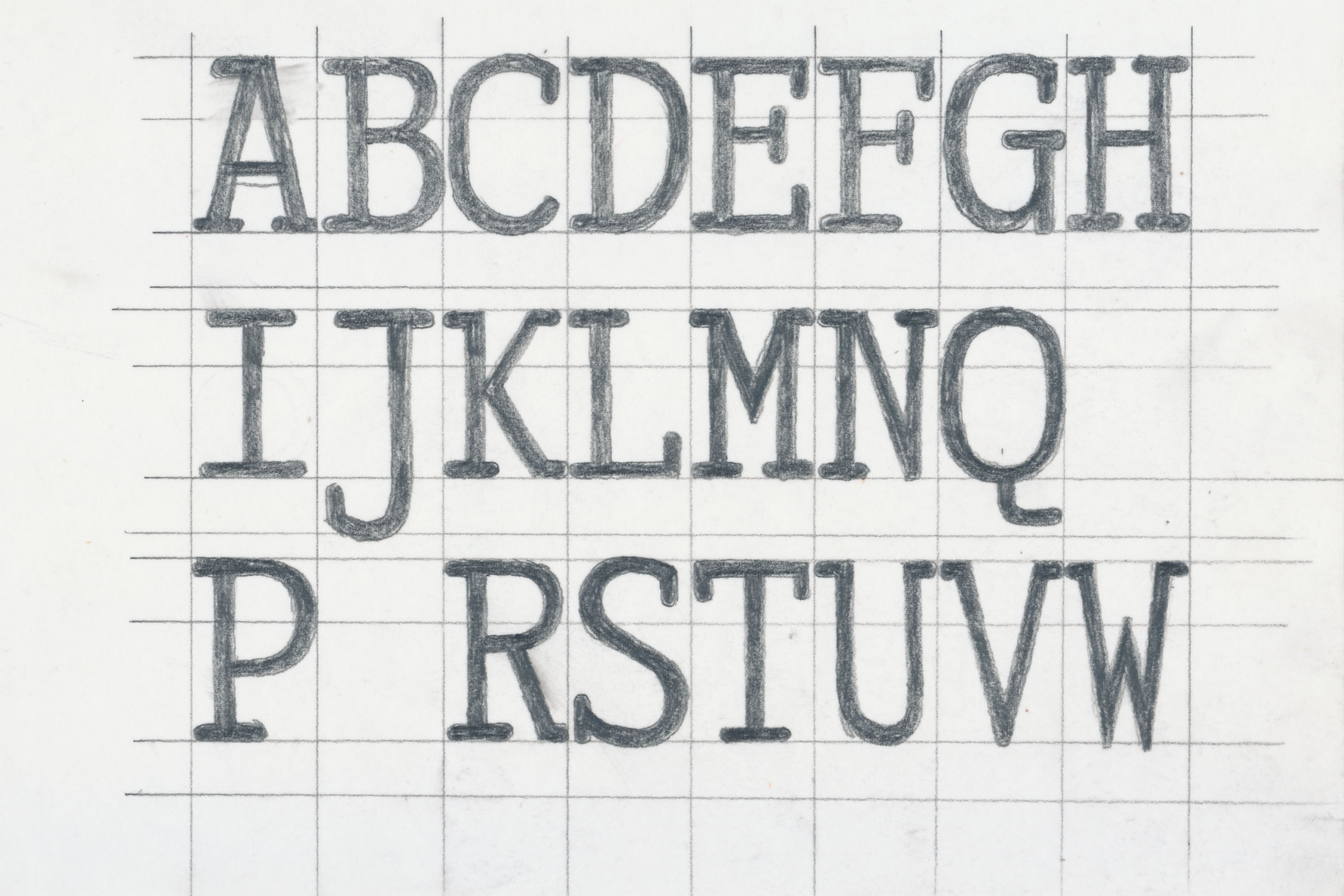
The simple, steady rhythm of monospaced fonts, where each character occupies the same width, continues to inspire designers long after the demise of typewriters. In today’s digital age, there are no technical constraints that compel us to use monospaced fonts. Yet, these fonts are often chosen for purely aesthetic reasons. Their minimalist and seemingly un-designed appearance makes them a popular choice when designers seek an informal voice.
However, in such cases, what is desired is a font that appears monospaced, rather than one that strictly adheres to monospacing. A far more even and pleasing rhythm can be achieved by relinquishing the requirement for every character to occupy an identical space.
Idt One combines the simplicity of a monospaced typeface with the elegance of meticulous spacing and kerning. Naturally wide characters are given room to breathe, eliminating unsightly gaps around narrower characters.
For contexts such as programming, where a true monospaced typeface is essential, we offer Idt One Mono.
- Designteam
-
Örjan Nordling, Kent Nyberg, Kristian Möller and Anders Wikström.
- Client
-
Identitype
Opentype features
Light
Syncopate
Regular
Pulsation
Medium
Repeating
Bold
Resonance


Light
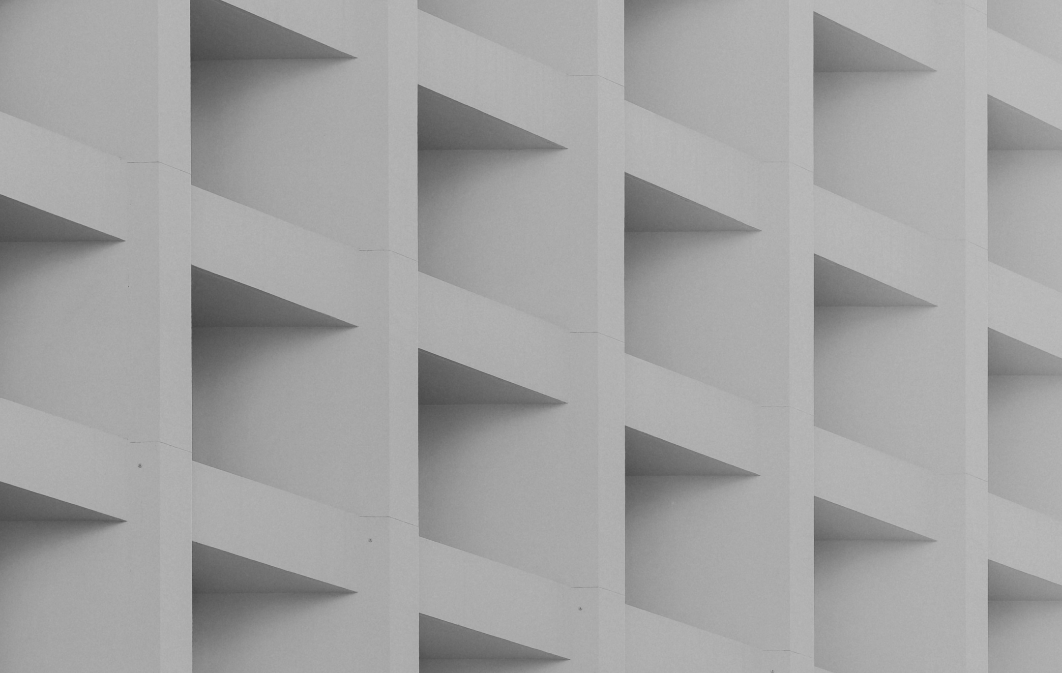
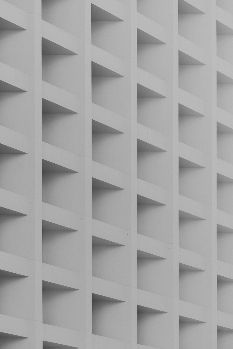
Rhythm and space are two fundamental elements in the realm of design, whether it be in architecture, visual arts, music, or even the layout of a room. These elements dance together to create a sense of harmony, balance, and visual interest. In this exploration, we will delve into the significance of rhythm and space in design, how they interact, and the impact they have on our sensory experiences. Rhythm is a dynamic force that infuses life into design. It is the repetition, alternation, and progression of visual or auditory elements within a composition. Rhythm can be regular and predictable, like the beat of a drum, or irregular and syncopated, like a jazz improvisation. In design, rhythm can manifest in various ways. In visual arts and graphic design, visual rhythm is achieved through the repetition of shapes, lines, colors, or patterns. This repetition creates a sense of movement and continuity, guiding the viewer’s eye through the composition. In architecture, rhythm is evident in the repetition of structural elements such as columns, arches, or windows. These repeating elements establish a cadence and flow within the built environment. In music, rhythm is the heartbeat of the composition. It dictates the tempo, meter, and timing of musical notes, creating patterns that engage the listener’s sense of time and space. Space is the canvas upon which rhythm unfolds. It is the void between objects, the physical boundaries of a room, or the expanse of a landscape. Space can be categorized into two main types. This is the space occupied by objects, forms, or elements within a composition.
Regular
Rhythm and space are two fundamental elements in the realm of design, whether it be in architecture, visual arts, music, or even the layout of a room. These elements dance together to create a sense of harmony, balance, and visual interest. In this exploration, we will delve into the significance of rhythm and space in design, how they interact, and the impact they have on our sensory experiences. Rhythm is a dynamic force that infuses life into design. It is the repetition, alternation, and progression of visual or auditory elements within a composition. Rhythm can be regular and predictable, like the beat of a drum, or irregular and syncopated, like a jazz improvisation. In design, rhythm can manifest in various ways. In visual arts and graphic design, visual rhythm is achieved through the repetition of shapes, lines, colors, or patterns. This repetition creates a sense of movement and continuity, guiding the viewer’s eye through the composition. In architecture, rhythm is evident in the repetition of structural elements such as columns, arches, or windows. These repeating elements establish a cadence and flow within the built environment. In music, rhythm is the heartbeat of the composition. It dictates the tempo, meter, and timing of musical notes, creating patterns that engage the listener’s sense of time and space. Space is the canvas upon which rhythm unfolds. It is the void between objects, the physical boundaries of a room, or the expanse of a landscape. Space can be categorized into two main types. This is the space occupied by objects, forms, or elements within a composition.
Medium
Rhythm and space are two fundamental elements in the realm of design, whether it be in architecture, visual arts, music, or even the layout of a room. These elements dance together to create a sense of harmony, balance, and visual interest. In this exploration, we will delve into the significance of rhythm and space in design, how they interact, and the impact they have on our sensory experiences. Rhythm is a dynamic force that infuses life into design. It is the repetition, alternation, and progression of visual or auditory elements within a composition. Rhythm can be regular and predictable, like the beat of a drum, or irregular and syncopated, like a jazz improvisation. In design, rhythm can manifest in various ways. In visual arts and graphic design, visual rhythm is achieved through the repetition of shapes, lines, colors, or patterns. This repetition creates a sense of movement and continuity, guiding the viewer’s eye through the composition. In architecture, rhythm is evident in the repetition of structural elements such as columns, arches, or windows. These repeating elements establish a cadence and flow within the built environment. In music, rhythm is the heartbeat of the composition. It dictates the tempo, meter, and timing of musical notes, creating patterns that engage the listener’s sense of time and space. Space is the canvas upon which rhythm unfolds. It is the void between objects, the physical boundaries of a room, or the expanse of a landscape. Space can be categorized into two main types. This is the space occupied by objects, forms, or elements within a composition.
Bold
Rhythm and space are two fundamental elements in the realm of design, whether it be in architecture, visual arts, music, or even the layout of a room. These elements dance together to create a sense of harmony, balance, and visual interest. In this exploration, we will delve into the significance of rhythm and space in design, how they interact, and the impact they have on our sensory experiences. Rhythm is a dynamic force that infuses life into design. It is the repetition, alternation, and progression of visual or auditory elements within a composition. Rhythm can be regular and predictable, like the beat of a drum, or irregular and syncopated, like a jazz improvisation. In design, rhythm can manifest in various ways. In visual arts and graphic design, visual rhythm is achieved through the repetition of shapes, lines, colors, or patterns. This repetition creates a sense of movement and continuity, guiding the viewer’s eye through the composition. In architecture, rhythm is evident in the repetition of structural elements such as columns, arches, or windows. These repeating elements establish a cadence and flow within the built environment. In music, rhythm is the heartbeat of the composition. It dictates the tempo, meter, and timing of musical notes, creating patterns that engage the listener’s sense of time and space. Space is the canvas upon which rhythm unfolds. It is the void between objects, the physical boundaries of a room, or the expanse of a landscape. Space can be categorized into two main types. This is the space occupied by objects, forms, or elements within a composition.