Graphic design
Visual identities
Identitype, through its founder Örjan Nordling, has been involved in over 250 visual identity projects of varying nature, with extensive experience in assignments that include logotype development, heraldry, brand architecture, hierarchy and strategy, visual identity, signage design, UX, and co-branding. We are skilled in agile work processes and methodologies.
Examples include visual identities for governmental agencies and public organizations such as: Stockholm University, KTH, Mälardalen University, the Swedish Pensions Agency, the Swedish Civil Contingencies Agency (MSB), KTH, and SL.
Assignments also include visual identities for trade unions like Saco, LO, Seko, Byggnads, and place branding for the municipalities of Södertälje, Gävle, Strängnäs, Huddinge, and City of Lidingö.
We have also been involved in transforming companies like Dagens Nyheter, Vasakronan, STIM, and Tekniska verken.
Wayfinding, icons and pictograms
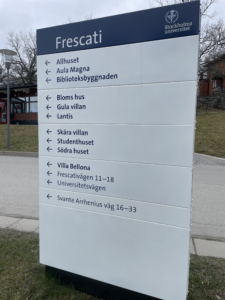
Signage Stockholm University.
Identitype has extensive experience in wayfinding and signage systems. We have worked on visual identities implemented in signage for government agencies, public institutions, as well as commercial companies. Examples include Stockholm University, Örebro University, Mälardalen University, SL (Stockholm Public Transport), The Municipality of Södertälje, Stockholm City Museum, the National Museum of Science and Technology, the Swedish Post and Telecom Authority (PTS), Huddinge, Vasakronan, Tekniska verken, and the Swedish National Property Board.
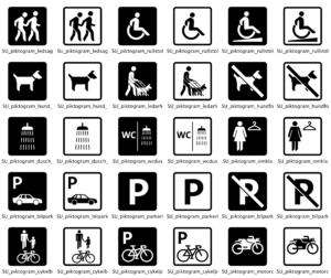
The work includes designing flows, navigation structure, signs, user interfaces for digital signage, and program documentation. These projects also include the development of identity-bearing graphic elements and imagery: pictograms, and icons.
Logotypes and symbols
![]()
Logotype Albert Bonniers Förlag.
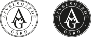
Creating a logo for a client is a process that involves several steps.
Analysis: The first step in creating a logo is understanding the values and goals of your client. A logo should visually represent the client (business) and its values.
Sketching: The next step is to develop a concept and sketch various ideas for the logo. This can be done on paper or digitally. Often, several different versions of the logo are created.
Typography: Typography is crucial for the logo. It’s essential to choose a typography, a typeface, that fits the client’s expression and brand. Preferably, select letterforms that are easy to read and recognize.
Color Palette: The colors used in the logo are also important. Choose a color palette that suits the brand and the desired feel. Consider how the colors appear in combination.
Original: Once you’ve decided on the logo’s design, it’s important to create a vectorized version. This can be scaled up or down without losing quality and is suitable for various contexts.
Testing and adjusting: It’s crucial to test the logo in different contexts and make adjustments if necessary. The logo should be tested on various backgrounds, sizes, digital resolutions, and prints.
Logo vocabulary
Monogram.
The word “logotype” comes from the Greek words “logos” (word) and “typos” (type). In everyday language, it is often referred to as a “logo”. The logotype usually works best in a visual identity alongside colors, typefaces, graphic elements, images, and typography.
Logotype/logo = A logotype is a graphic brand, a word/image, or a combination of these used for visual recognition.
Symbol = A representation of an object, abstract concept, idea, or characteristic.
Wordmark = The form or appearance of a specific word, paragraph, or text, or the visual impression the text creates, either in printed form or on-screen.
Heraldic Arms = A recognizable sign in the form of a coat of arms designed according to heraldic rules. National emblems like the swedish Royal Crown or Three Crowns are common.
Monogram = A name cipher consisting of one or more individuals’ initials, the abbreviation for a company, or an activity often in an artistically stylized form.
Icon = A symbol or written sign (ideogram) representing an object or concept through a usually simplified illustration.
Pictogram = A stylized illustration depicting a phenomenon, such as a woman or man for a restroom.
A Foundation in facts
To achieve the best results in a creative process for a visual identity, a typeface design or a way finding system, facts and insights should guide the work. These can be gathered in various ways but are always rooted in the organization’s values, needs, and goals. A design entirely led by the designer seldom proves effective; it’s the organization that will use and embody the visual identity. Defining the starting point may involve workshops, benchmarks, analyses, and surveys.
Collaboration and expertise
The client knows their field, and the designer knows theirs. Close collaboration ensures that, together, we identify the success factors that build a strong brand, requiring openness and a lack of ego from both sides.
If you would like to work with us on a project, we can bring our expertise. There will likely be areas where we may need support, so we’ve listed some collaborators we typically work with. Today’s communications landscape requires specialized expertise, making it essential to engage the most knowledgeable professionals. We enjoy working in teams where the client’s project group can benefit from our external expertise.
We would love the opportunity to work with you!