News
Pictograms for National Property Board (Statens fastighetsverk)
Graphic design
![]()
In collaboration with the experienced signage and wayfinding company HolmquistSign, Identitype has developed a set of pictograms for the government agency National Property Board of Sweden (Statens fastighetsverk). The pictograms follow the agency’s recently revised visual identity in both form and expression. They also comply with SIS standards for international symbol language.
The pictograms have been designed in a functionalist style and match the agency’s house typeface, SFV Funkis, combining beautiful proportions, elegance, and expressiveness with a modernism rooted in the functionalist movement that gained prominence in Sweden during the 1930s. The pictograms are available in positive, negative, and outlined versions.
The new pictograms will be used at all locations and visitor destinations managed and owned by the SFV, both indoors and outdoors. They are intended to help visitors navigate accurately, find their way, and access relevant information and guidance.
We at Identitype are proud to have been part of this important assignment.
Client: Stefan Trolle Lindros, SFV, Dan Holmquist, HolmquistSign
Designer: Örjan Nordling and Anders Wikström, Identitype
Orvar, a typeface for Örebro SK
Custom font
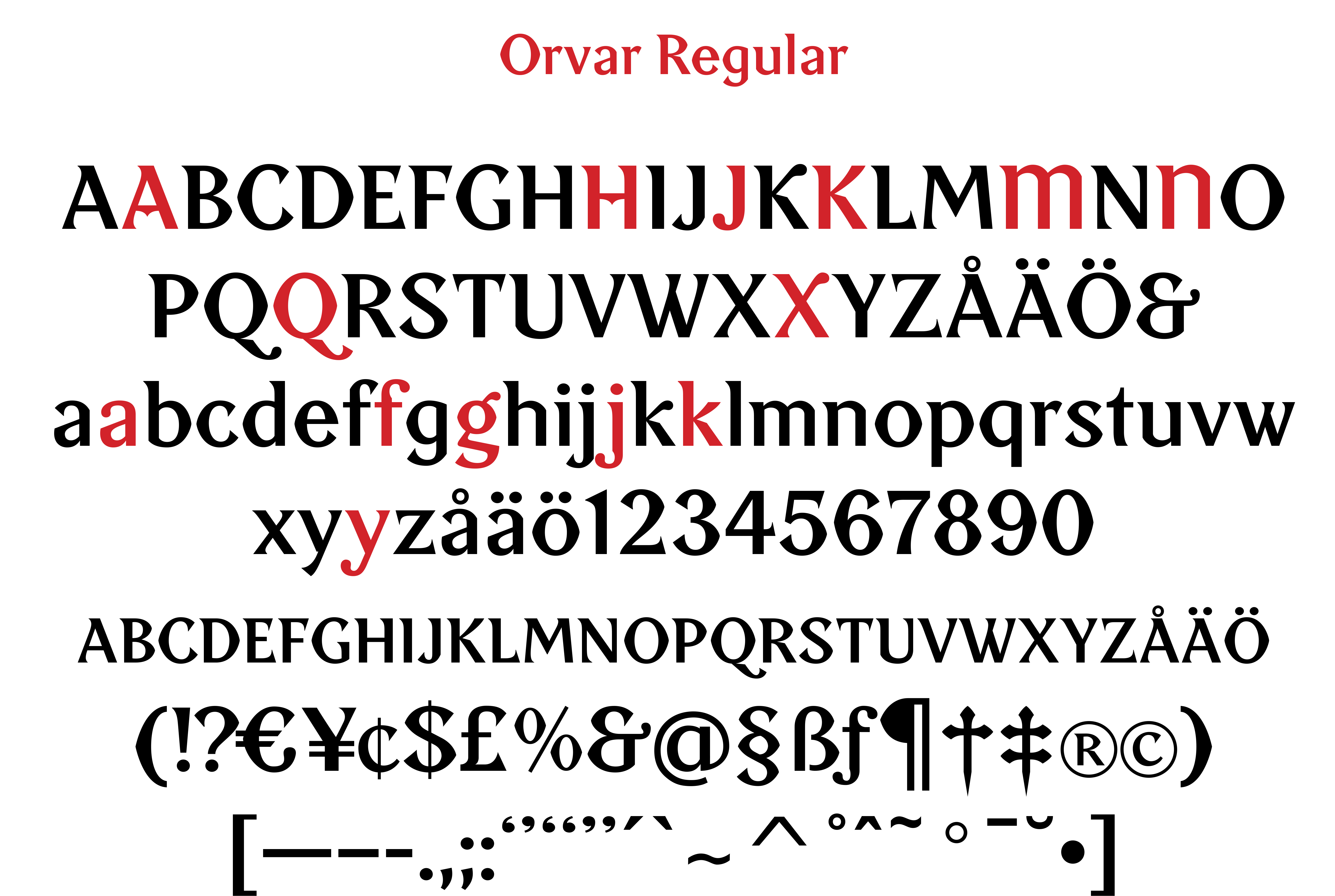
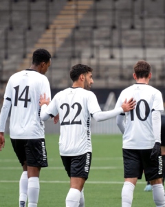
Wow, I’m so happy! My football team, Örebro SK, will play the men’s preseason matches wearing jerseys with my typeface “Orvar” on the back. The typeface is named after Orvar Bergmark [1930–2004], the club’s most famous player of all time.
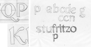
“Orvar” draws its foundation and inspiration from ÖSK’s club emblem from 1908. The capital letters ÖSK in the emblem are designed in a characteristically Art Nouveau-inspired style, featuring “bifurcated” letters – split into two horizontal parts – which give them a unique character.
A good, identity-creating display typeface should not only be easy to read but also carry a sense of emotion and tradition. “Orvar” tells the story of a sports club that has always stood for pride, heart, and passion and has mostly belonged in football’s top tier. And that’s where we want to return!
I designed the typeface back during the successful Allsvenskan seasons of 2009–2010, together with designer Göran Söderström. But it is only now that it gets to see the light of day in thrilling match situations!
I truly hope that “Orvar” can contribute to ÖSK’s success in the crucial spring cup matches of 2025!
https://www.facebook.com/share/p/1DpCCnAhxM/
https://www.instagram.com/p/DFNX2zZIVIg/?utm_source=ig_web_copy_link&igsh=MzRlODBiNWFlZA==
Typofix representative
Merits
Identitype owner Örjan Nordling has been appointed swedish representative in the Typofix Project.
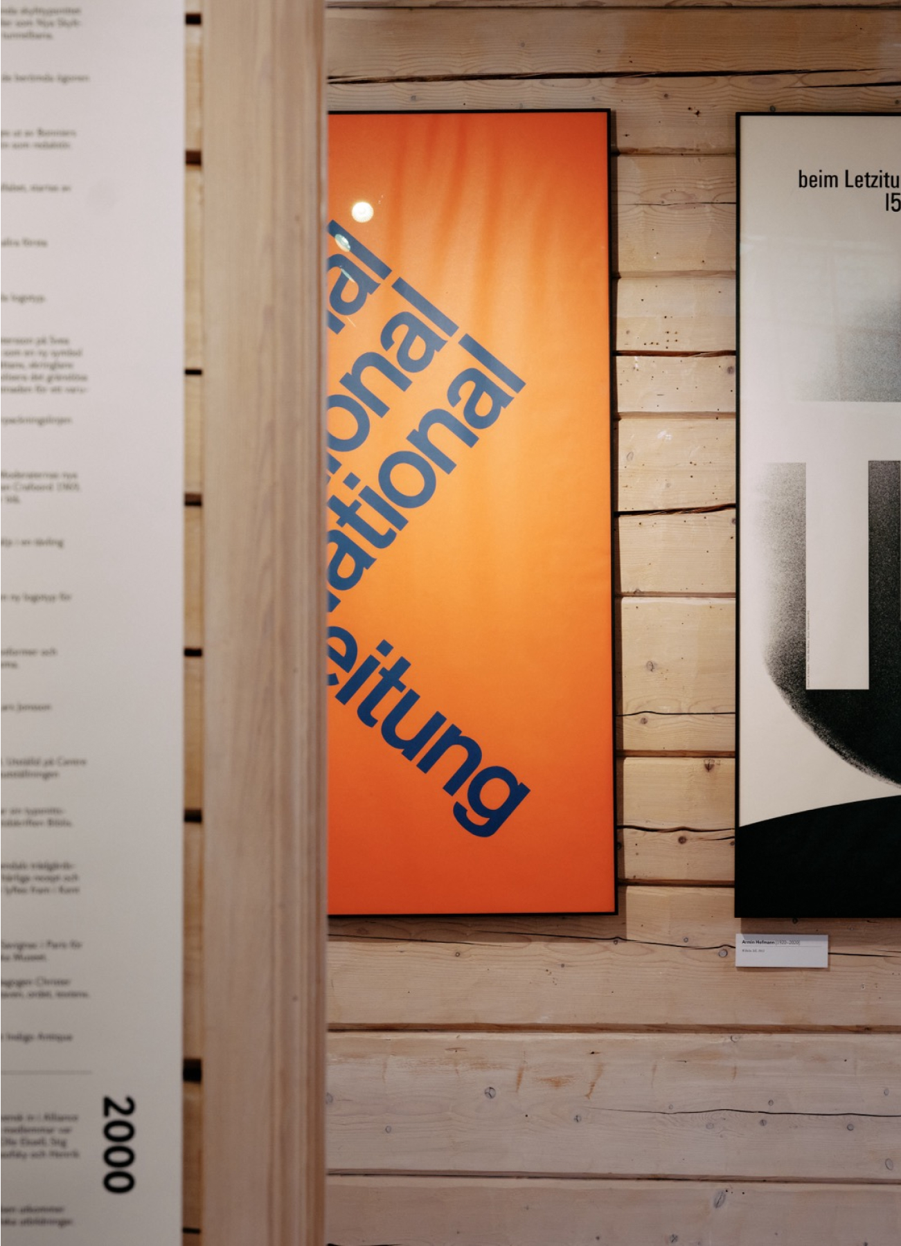
Bokstavligt/Lettered: A Narrative on Typography
Exhibition
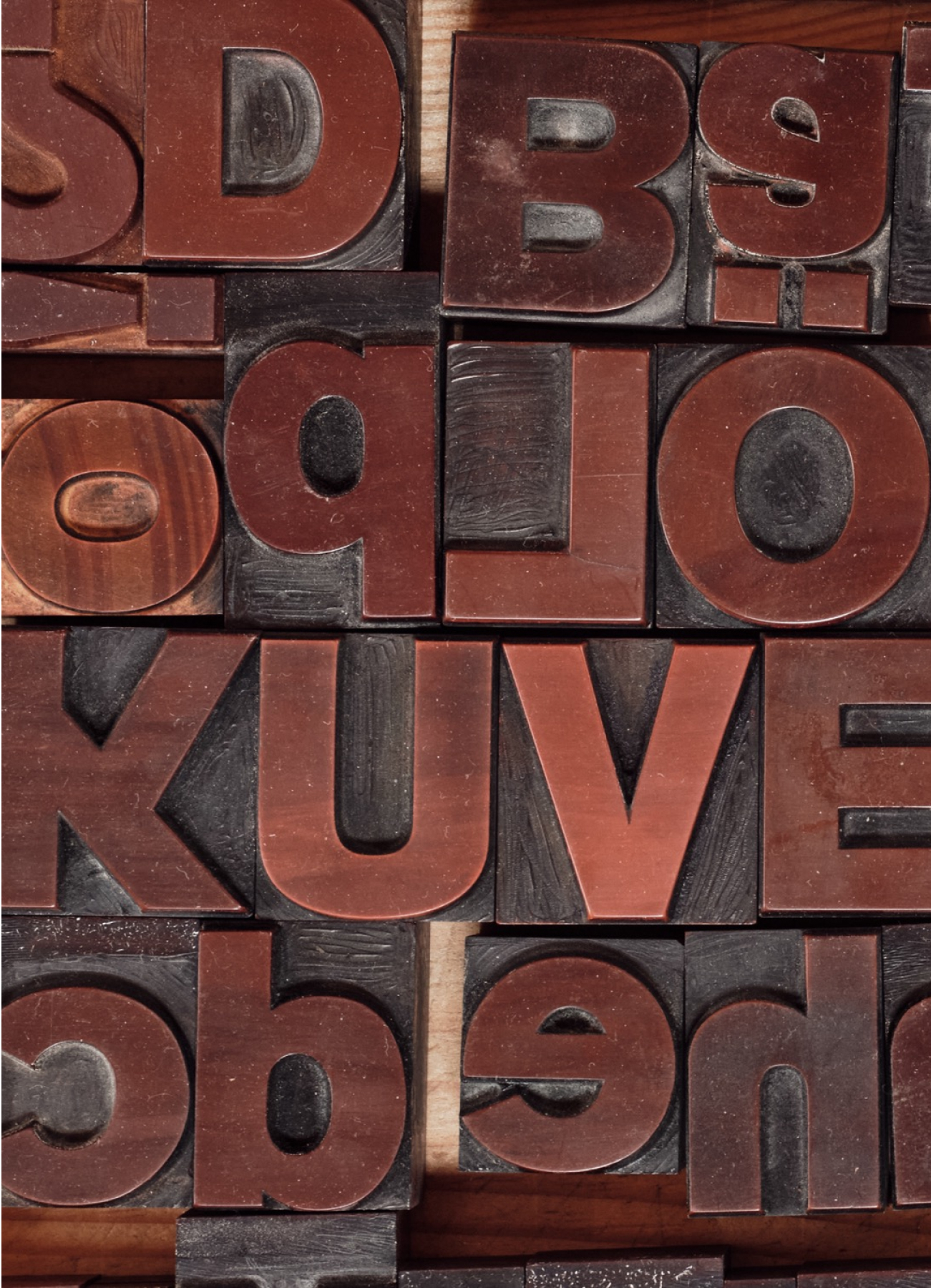
Letters and typefaces are crucial tools in graphic design and visual communication. In our modern writing system, the Latin alphabet serves as the foundation. Typefaces represent the visual style in which letters are presented.
There are thousands of different typefaces to choose from, varying in style, size, expression, and other characteristics. Each typeface may have its own specific use, with some suitable for headlines and others more appropriate for body text. By selecting the right typeface, one can create a particular atmosphere, convey a specific message, and enhance readability. This is what we refer to as typography.
When I was asked to have an exhibition of my work, my first thought was – I’m not an artist but a graphic designer.
But if you think further, graphic design is a kind of “everyday art”.
We come into contact with it every day in the form of text and images in various channels and contexts. Messages are constructed with letters and symbols; they shape words that form sentences and give us meaning. Long after we are gone, the visual language persists.
This exhibition is about graphic design, but primarily about typefaces and typography. That’s what I’ve been involved in for almost 40 years.
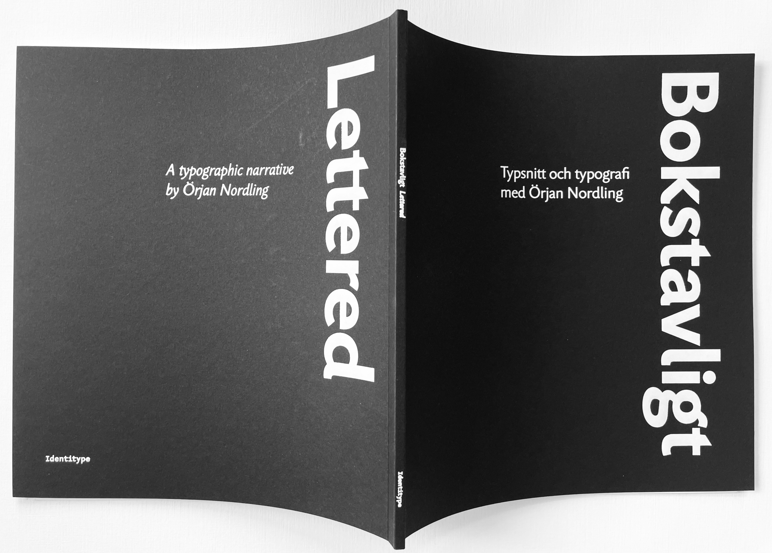
Bokstavligt/Lettered: Catalog
Publication
This exposé is a work about and by the designer Örjan Nordling. It addresses graphic design and typography in Sweden, mostly in recent years, from the mid-1980s to today. However, the primary focus is on the elements of typography, the various typefaces, and their development concerning form, design, and technical production. Already during his formative years in high school, Örjan was introduced to the design of printing types. During his education at the artistic university Konstfack and as a guest student at Kunstgewerbeschule in Basel, he worked on his first typeface, Nordling BQ. Since then, he has been involved in the development of several typefaces and has a long career in the typographic field. It is an instructional and educational text.
The preface is written by Håkan Lindström, teacher in graphic design at Grafiska Institutet and Konstfack School of Arts, Stockholm, professor 1987–94
This book can be ordered from Antikvariat Morris: www.antikvariatmorris.com.
Identitype AB. Åkersberga, Sweden. 2024. 22 x 24 cm, 64 p. Soft bound with black board cover. Front, spine and back lettered in white gilt. Richly illustrated.
Graphic design by Örjan Nordling.
To get a PDF version of the catalog, click here.